
Architects spend the majority of their time analyzing form, space, and details; however, color permeates society, yet is often overlooked.|1|
Odd color palettes can become fashionable during different eras or for various functions, yet natural colored materials can never be outdated – unless the material itself becomes unfashionable. This post is a follow-up to City Park Signage. Where I will reveal with limited fanfair the “winning” design to be utilized for all city park entrance signs.
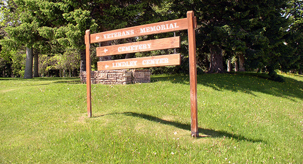
A reputable architecture firm with “extensive park entrance sign experience” was chosen as the winning designer. The signage shows that a perfect kit of parts, does not guarantee a great design. Indeed, the sign stands out for all the wrong design reasons. Namely its horrible color.

The sign is comprised of ¼” plate steel bolted to steel w-sections that will weather and reveal rust through time. The plate steel is powder-coated to create a consistent color-scheme for all the park signage, plus a local graphic design company created a unique logo for every park sign.
Unfortunately, the color choice for the interior of one’s house may be the worst color for city signage. The repugnant color is probably called Concord Cream, but it should be renamed Indecisive Yellow.
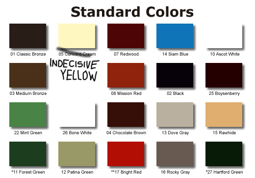
Instead of being a vibrantly pungent slightly-distracting yellow, Indecisive Yellow yearns to be earth-toned, but natural earthen materials have varied colors and textures. While you might argue tan is an earthen color, a smoothly painted high-gloss tan surface does not appear to mimic a chunk of sandstone. Natural materials have a natural color palette, but varying textures, shadows, and microscopic varied particulates create the natural appearance. Indecisive Yellow comprised of only one hue in high-gloss paint is the opposite of natural – it actually makes the steel appear fake.

Do you know what color is natural? The wood on the original sign!
Psychotherapists proclaim that indecisive people are “not actually interested in making a decision.”
Indecisive Yellow doesn’t want to be either brazen, nor blend-in, therefore, it exists in a purgatory world of hideous design.
It’s similar to the TV show LOST.
*—Start of Spoiler Alert—*
The series finale ends not necessarily in Purgatory, but in a Quasi-purgatory. Because Purgatory is a Christian belief, they created a Quasi-purgatory suitable for all religions. Essentially nothing was concluded nor resolved, but by neither attempting to resolve everything or resolve nothing they actually created something far worse: an indifferent resolution that has become the worst TV show finale ever.
*—End of Spoiler Alert—*
Bozeman has a fairly mundane color-palette for buildings; comprised mostly of earthen-toned brick and stone.

Main Facade Color Palette
The trim details for windows and cornices is slightly more lively, but still fairly limited in color range.

Trim Color Palette
However, Bozeman has a history of brazen and colorful signage. There is a giant revolving horse statue, and a 32-foot high and 45-foot wide neon sign affixed to the roof of Bozeman’s tallest building.
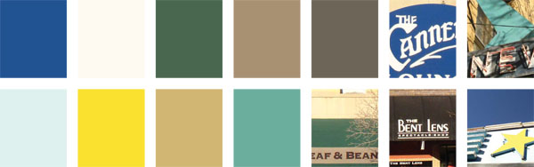
Signage Color Palette
Incorrectly, this new entrance park signage attempts to mimic the facade color of buildings instead of actually realizing it is a sign.
Mies van der Rohe once said,
-Mies van der Rohe“It is better to be good than to be original.”
However, all too often cities and people produce poor designs not because they are trying to be original, but by incorrectly assuming past designs are actually good.
The amazing design I submitted to Thom White|2| (the Parks/Cemetery Superintendent) was comprised of similar materials as the winning design, but was thoroughly rejected on the moral grounds of me having no experience in designing park entrance signs.|3|
His response email to my submittal was:
-Thom White“Brady-
We just got down evaluating proposals for the entrance signs- Your proposal was really neat, yet we went with a company that has produced park entrance signs in the past… Thanks for your interest in the signs and our community.”
Apparently, signage design is an incredibly hard industry to break into. Of all the complainer’s in Los Angeles trying to get his or her big shot in Hollywood, try coming to Bozeman, MT to graphically design signage. And not just signage design, but the niche market of Park Entrance Signage design. There should be a labor union for this specialized field.
There is (roughly) zero life-safety issues to consider, is non-ADA compliant, and requires no specialized education – only prior experience.
However, it’s the catch-22 of industry, you have to have experience to be qualified, but you will never be qualified enough to gain experience. Perhaps I should design and manufacture signs and place them in my backyard. I now wonder if I should have touted my experience printing Garage Sale signs and stapling them to neighborhood telephone poles.
- Future Resume:
- Entrepreneur with extensive experience in local marketing endeavors and signage design. Successfully designed, manufactured, and installed over 10 signs in coordination with the local Telecommunications provider.
What is perhaps saddest of all is the submission for the winning design:

Yes, a photograph of the exact same failed sign they designed for the city 7 years prior.
Signage needs to be instantly recognizable, that citizens can rally around and easily identify. Through a haphazard ill-thought out process of selecting city park signage, an unattractive new identity has been created. Maybe High-Gloss Indecisive Yellow will become the PDX carpet – a repulsive carpet that citizens endear not because it was necessarily attractive, but because it was unique and would bring reminiscent thoughts of “home.”
Or perhaps, in our chaotic world with adverseness to change, Indecisive Yellow will become the rallying cry for chronic vacillators everywhere; if you can’t decide what your favorite colour is, a decision has already been made for you.

Footnotes:
Click the purple numerals to transport between hyperlinks
1 Especially by Richard Meier.
2 With a silent “H”.
3 And Thom probably thought I was 12 years old.